Visual Designer & Photographer

Project: Hutch Cafe Website Redesign
My Roles: UX/UI, art direction, research, wireframing, prototyping, copy, photography
Tools Used: Figma, Photoshop, Markup, Miro
The Team: Robyn Derdall, Gary Wong, Brendan McNeill
Date: September 2022
Setting the stage
Hutch Cafe is a new cafe/eatery in the sophisticated downtown neighborhood of Eau Claire in Calgary, AB. The restaurant offers coffee and tea, as well as wine & cocktails, food ranges from locally baked pastries to full plates on its impressively extensive French-inspired menu.
Outlining the challenge
Whats the problem?
Hutch Cafe's website required a redesign. At the time the current version had
-
Subpar overall website navigation, redundant pathways, and opportunities to improve the information architecture
-
An aesthetic approach that did not align with the client's vision or the actual physical dining space/food & drink
-
Lack of legibility - ex: Menu items had no change in font size or style to establish a hierarchy for the title, description, price, etc.
-
Poor content organization, not using screen real estate in the most effective manner.
-
Gallery poorly laid out, with small, outdated images and not regularly updated.
-
Mobile capabilities not consistent or reliably functioning.
Whats the solution?
A full website redesign to address all of the aforementioned problems. Reevaluate the information architecture.
The new design will give users ease of access to all important information & operations (ex: hours of operation, location, ordering online, making a reservation, applying for a position, etc.) In a clean, visually appealing and organized manner. It will also offer an intimate look at the food + drink offered and the space itself to more effectively encapsulate the dining experience. Optimized for various screen sizes.
Improving the user experience will make the local business more enticing for new guests and create a simplified, reliable and intuitive functionality for regular patrons.
The design process in action
To kick the process off I did the following:
-
A full content audit of the (then) current site
-
Reviewed guest testimonials and reviews of the restaurant/cafe
-
Got familiar with all stakeholder grievances
-
Competitor research to outline successes and shortcomings referencing industry-leading resto/bar websites

above: a research board full of page spread references collected from restaurants, bars and cafes from Calgary, to New York, to LA.
Competitor Analysis
As I conducted this research, here is what I paid attention to:
-
Communication with site visitors, I examined tone, vernacular, content copy & micro copy, how does this all work together to tell a story and establish brand trust?
-
Information architecture, how was content & information organized, and what components were prioritized? I examined user journey flows, and dissected which information is deemed most important and placed front and center.
-
Mobile optimization, how does the shift in screen size affect the completion of user goals such as reading a menu or browsing a gallery? + How is information disseminated?
-
Identify graphic elements that made the experience stand out and solidified brand identity. Things such as color pallets, style guides, typography & digital assets such as iconography, illustrations or photography. How did these contribute?
-
On a broader scale, I analyzed the overall content strategy, auditing the sites and asking myself, how do they attempt to convert new or undecided users to order online or try the restaurant in real life?
-
Opportunity gaps are always in the peripheries of my mind- what's missing from these user journey flows that could be tweaked, improved or perfected in my design? Extensive guest input paired with my own personal experience of frequenting cafes, restaurants and bars gave me a holistic perspective.
-
Community engagement- such as social media integration, involvement campaigns & calls for hiring.
-
Analyzing & differentiating between current design trends and design principle staples, but approaches can be embraced and utilized. Is anyone pushing the boundaries in a way that's refreshing or could be indicative of future commonplace practice? Ex: Non-scroll homepage, all information & links are placed in a single frame or interactive digital assets such as animations or automatic scrolling content.
Key Findings
-
The less clicks the better, all essential information should be in one place- commonly the homepage, make a compelling & transparent first impression + a seamless information driven experience.
-
Quality digital assets are essential, showcase the food, drink, space and style and do it often.
-
Who are you? What is your philosophy, whats your story? You're serving guests food and drink, this is an intimate experience that requires trust, connect with the user by being honest & authentic.
-
Simple yet effective, this isn't a complicated web project in terms of its structure, but it must be streamlined and unified, the message is simple, try our food & drink and experience our space. The persuasion comes from content that emphasizes uniqueness, and is organized and intuitively placed.
First iterations
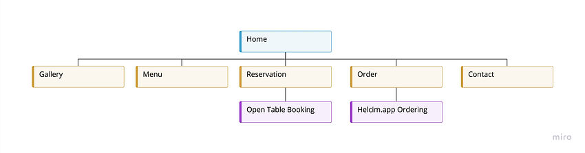
Upon completion of the research stage I simplified the navigation pathways to four pages, home, gallery, menu and contact. Reserving and ordering online would also have their navigation links, but these operations were completed through external online services.
All necessary information needed to be included in one place, that being the home page. I established which information would be deemed necessary through my aforementioned competitor research. This included links to order or make a reservation online, a robust gallery, a unique Hutch Cafe experience, contact information, location, hours of operation and external links to socials. I also decided to include a brief history & about us segments on the home page to establish brand identity & trust.

above: low & med fidelity mock-ups of the home page and gallery page. Later updated for readability & mobile optimization considerations.
Revised Information Architecture

A Hutch Cafe signature
Hutch Cafe offers an 'Afternoon Tea' menu item that had been gaining popularity in-house. An authentic tea time experience, each tea set includes sweet and savoury items, a scone and a pot of tea, generally for 2 or 3 people.
Surprisingly there was little information about it online. Additionally, there had been multiple inquiries about whether it was Hutch Cafe that offered this or some other nearby spot. I decided the unique afternoon tea experience had to be highlighted with an option to order or reserve a set online. Because of its popularity, and exclusiveness to Hutch Cafe, I found it to be worthy of its own feature block on the home page.

Connecting the brand experience
Hutch Cafe is owned by the same folks who own Hutch Kitchen. For this reason, and that Hutch Kitchen products are sold, used and related to the Hutch cafe experience, I decided to add a Hutch Kitchen history segment & an external link to the Hutch Kitchen website in the website footer. This encouraged organic traffic to the recently redesigned Hutch Kitchen website. It established the two as part of a cohesive brand and displayed the company's confidence in its products, using them in a front-facing manner, every day.
Page spreads

Mobile Optimization
Color, typography, iconography & buttons


Menu layout - Design specs & alternatives


Final Version
Results & next steps
The website was recently completed, with high praise from stakeholders, all initial pain points were alleviated and new design choices were embraced through usability testing. Pending some small changes to the menu and home page updates, the website is expected to go live for mid-May.
What did I learn?
Since I was working with the same web developer as the Hutch Kitchen project, we had developed more of a synchronicity. Additionally:
-
I had taken the time to get familiar with WordPress & its custom backend capabilities, I could assist in making small tweaks and adjustments to save the company money from billing for extra web development work.
-
The handoff process went smoother. Collaboration tools such as Figma, Miro & Markup made the communication of design specs & layout a lot easier.
-
I learned to refine my skills of editing, that is, editing down to the bare essentials, capturing the essence of an experience, a place and a narrative. This involved trimming down text and removing redundant images. I worked hard to maintain a balance between both a simple and engaging design. Ensuring accessible information and functionality was the top priority.